Nasa.gov User Research
< Back to the Table of ContentsNasa.gov Web Modernization
The Nasa.gov Web Modernization project, and the resulting Horizon Design System, utilized multiple types of user testing methods including large national surveys, multiple rounds of qualitative 1:1 feedback, and usability testing sessions.
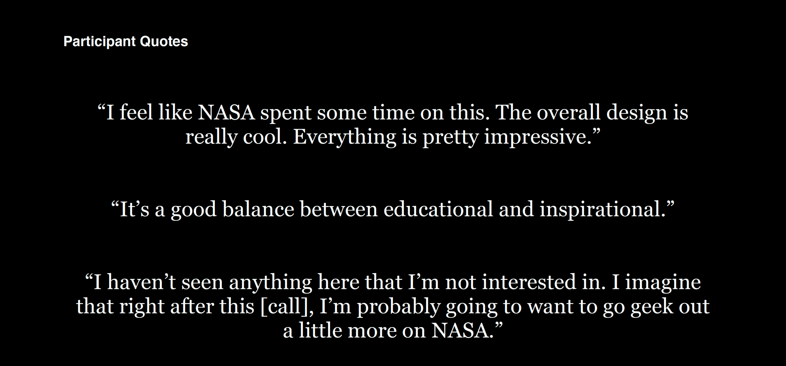
These are highlights from one of many qualitative research sessions conducted between 2019-2021. Watch user feedback on proposed visual design directions and interaction design concepts for nasa.gov. Findings include user reactions to visual styling, comparisons and associations that the visual design directions evoked for users, and how those reactions relate to their expectations of the NASA brand. The report also includes insights on user perceptions of the value, functionality, and usefulness of key interaction design concepts.
“Explore” navigation
Participants react to the “Explore” global navigation, including their perceptions of the advantages and disadvantages of using such a menu.
Current mission page
Participants react to the content, structure, and user experience of a current mission page, OSIRIS-REx.
Page template feedback
After viewing a subtopic or historic mission page, participants are asked what they expect to see on a current mission page.
Why I’d go to NASA.gov
Participants explain the type of information they would seek out on NASA.gov, including information about the latest NASA missions, and more general science-related content.
Research Final Reports
Phase 1
Full survey insights report
This report outlines the findings from our survey of the general public. This report also includes deep dives on specific groups, including K-12 teachers and students, women, those with disabilities or accessibility challenges, and those uninterested in science and space topics.
Research Final Presentation
This report was presented to the NASA Web Modernization Leadership team and includes integrated insights from both streams of research. For more detailed information and full insight reports, click on one of the links below.
Full interview insights report
This report outlines the key findings from our one-on-one interviews with NASA’s public audience. This report includes descriptions of the four segments, or “schools of thought,” common themes across all groups, and detailed insights about needs, motivations, and expectations around science and news content.
Phase 2
Blink NASA R1 Usability Research Findings Oct 2020
This report outlines insights from user interviews on proposed visual design directions and interaction design concepts. Findings include user reactions to visual styling, comparisons and associations that the visual design directions evoked for users, and how those reactions relate to their expectations of the NASA brand. The report also includes insights on user perceptions of the value, functionality, and usefulness of key interaction design concepts.
Blink NASA R2 Usability Research Findings Oct 2020
This report details findings from user interviews on key templates of the NASA.gov prototype, including: the article page, Humans in Space topic page, gallery page, image detail page, homepage, and site global navigation. Insights include observations on the overall usability of the templates and navigation patterns, feedback on the prototypes’ visual treatments, and reactions to content and content presentation.
Blink NASA R3 Usability Research Findings Nov 2020
This report outlines insights from user interviews on key page templates of the NASA.gov prototype, including: the News & Events page, current mission page, historic mission page, subtopic page (Robotics), and the interactive ISS “scrollytelling” feature. The findings include observations on the overall usability of the templates and navigation patterns, as well as user perceptions of the value and usefulness of the pages’ content and content presentation.


